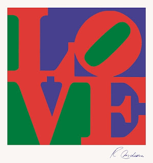
This time I decided that students could choose their own 4 letters to highlight in their project inspired by the work of Robert Indiana.
Students love learning about the iconic "LOVE" below. The balance of the blue and green. The slant of the "O". The way the red letters are all connected to each other without any seams between them. And the interesting relationship of the "L", "V", and "E" whereas they all touch the edge of the piece, yet the "O" doesn't touch the edge. Some say the "O" is meant to represent fragility or instability as it looks like it can roll off the picture at any moment. In opposition the other three letters are solidly placed.
The steps were:
1. Make 4 big letters on 4 white pieces of paper that were 4.5"x4.5" each.
2. Collage over the letters with magazine pictures.
3. Glue background construction paper color blocks on 9"x9" paper.
4. Glue collaged letters onto color blocks.
These were done by beginning High School art students, but it's such a simple lesson younger kids could do it too.


1 comment:
I did a Robert Indiana project recently: http://www.useyourcolouredpencils.blogspot.com.au/2012/02/love.html
But I really like your variation. Will keep this in mind for next time.
Post a Comment